ADVERTISEMENT
PHOTOS
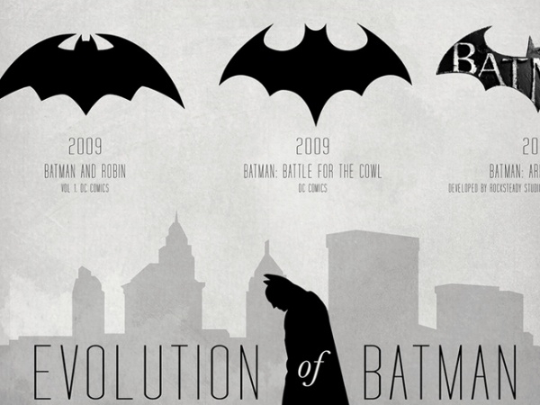
Batvolution: The Dark Knight’s Logo Throughout the Years
bill-swift - December 25, 2012
Batman has gone through a lot of changes ever since he was conceptualized. It was also all for the better. Can you imagine Christian Bale donning that horrible black-and-grey spandex costume for The Dark Knight Rises and running around chasing Bane and that two-faced Miranda Tate? No? Yeah, I thought so, because I can't myself.
Bruce Wayne's costume isn't the only aspect of the hero that was re-worked and eventually revamped to fit into current trends. His logo also went through a lot of changes through the years, and we've got the full Batvolution for you to view in the gallery.
I prefer the 1992 version of the Batman logo because it looks clean and well-defined. Also because that was probably Batman's logo when I was a kid and watched the old Batman movies and cartoons of the yesteryears...
What about you? Which one's your favorite?

Advertisement


ADVERTISEMENT
ADVERTISEMENT
Session expired
Please log in again. The login page will open in a new tab. After logging in you can close it and return to this page.